Interesting Paper: Global warming and invertebrate colouring
Just now another very interesting paper has been published in Nature Communications, which was written by former colleagues of mine from the University of Marburg.
Global warming favours light-coloured insects in Europe
As we all know many insect species like butterflies, bees or dragonflies have their main activity pattern during the day due to their ectotherm thermoregulation. Body colour is an important aspect of this thermoregulation as darker ( more blackish) individuals usually heat up faster. Therefore darker insects have an advantage compared to brighter insects in cooler climates as they heat up more rapidly and can forage earlier. This pattern can be mapped on a larger scale using occurrence data and has been known as “thermal melanism hypothesis” in macroecology. The authors go a step further from here as they not only display a new biogeographic pattern previously unknown to science ( colouring gradient of European dragonflies and butterflies from south to north), but they also demonstrate how this mechanistic link between a macroecological pattern and a functional trait can be used to forecast the effect of climate change on insects.

From Zeuss et al. (2014): Shift in colour value for (a) the raw data; (b) the phylogenetic component (P); and (c) the specific component (S). Red indicates an increase in colour lightness; blue indicates a decrease in colour lightness. The diameter of each dot indicates the extent of the shift (n=1,845). The distribution of the shifts shows for the specific component a clear trend towards higher (that is, lighter-coloured) values (peak of the distribution positive; zero indicated by black line). The phylogenetic component suggests that the shifts in colour lightness have a strong phylogenetic background leading to a complex geographic mosaic in the response of assemblages to climate change. The inserted histograms show the mean change in colour lightness calculated for 1,000 alternative phylogenetic trees and are positive throughout, indicating that uncertainties in the phylogenetic hypotheses are unlikely to affect our conclusion of a general shift towards lighter assemblages. The distributional information used in the analysis is often based on a large time span, that is, the distributional information published in 1988 summarizes data until that year using information even from the beginning of the twentieth century. Rugs at the abscissa indicate observed values.
Possible critics: A definite next step in the analysis would be to include real measurements of optical colour rather than RGB values of scanned pictures. The colour values used in this study were all derived from scientific taxonomic drawings of those insects and thus biased by subjectivity of the respective artist. Nevertheless this bias should be consistent (if the same artist has sketched the images) so it should not influence the colouring gradient. It is also interesting to note that many insects ( I know this for instance from my work with bugs and hoverflies) can adapt their body colouring to their habitat or differ quite a lot within a population. Differing melanism in body color and wing colouration might be related to the climatic niche they occur in, but the insects themselves might also possess phenotypic plasticity to adapt for instance to different habitats and background (Hochkirch et al. 2008). This pattern certainly needs more investigations in the future.
The article has been published as open access paper, so give it a try 😉
-
Hochkirch, A., Deppermann, J. and Gröning, J. (2008), Phenotypic plasticity in insects: the effects of substrate color on the coloration of two ground-hopper species. Evolution & Development, 10: 350–359.
- Zeuss, D. et al. (2014) Global warming favours light-coloured insects in Europe. Nat. Commun. 5:3874
Distribution maps in R
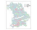
Today i’m gonna play a little bit with map features and show you how to make different basic distribution maps in R. Using the 2.14.1 Version of R i will make a graphical distribution map of the dragonflies species in Bavaria. The data was extracted from the book “Libellen in Bayern” and applied to a presence-absence matrix. The whole of bavaria was converted to a geographical grid (X,Y-Values), whose values came from available topographical maps. Iam open to any suggestions or other packages which could present such data in a fashionable way!
For basic great looking maps you could use the package sp and lattice. Also i suggest using the package RColorBrewer, which provides very nice color ranges. See the comments in the R-Code for explantations.
library(sp);library(lattice)   # Loads all libraries
data <- read.csv2("grid_bayern.csv",
header=T,dec=",",sep=";",na.strings="NA") # Load the data
### The date has the following columns: "X","Y","Diversity"
coordinates(data) <- c("X","Y") # Apply X-Y Values as coordinates to form a SpatialPointsDataFrame.
## coloured points plot with legend in plotting area and scales
spplot(data, "Diversity",
scales=list(draw=F),key.space=list(x=0.73,y=0.9,corner=c(0,1)),
cuts = 3, col.regions=brewer.pal(3, "Set1")[3:1],
legendEntries = c("small","avarage","high"))

## Blubble Plot --> Increasing bubble size for higher values
bubble(data, "Diversity", maxsize = 1.5,pch=19,
main = "Bavaria Dragonfly diversity", key.entries = c(1,5,10,25,50),scales=list(draw=F))
As some points seem to be missing you could also build an interpolated graphic. For this first we will need the packages maps, akima and fields. The code below loads in the dataset and defines our X and Y-Axis ranges and interpolates all data to adjacent areas based on contour-lines. Please note that these distribution is just a default kriging, which doesn’t have to be right. You need to look to some variograms and adjust your map to build the correct interpolated values.
library(RColorBrewer);library(maps);
library(akima);library(fields) ## Load all libraries
data <- read.csv2("grid_bavaria.csv",header=T,
dec=",",sep=";",na.strings="NA") ## load the data
rx=range(data$X);ry=range(data$Y) ## define the ranges of the plots

int.scp <- interp(data$X,data$Y), data$diversity, duplicate="strip") ## Make an interpolation

# Build the image plot with the interpolated values
image.plot(int.scp,xlim=rx,ylim=ry,legend.shrink=0.7,
col=brewer.pal(10, "Spectral")[10:1],nlevel=10,main="Spatial Diversity")
#contour(int.scp,add=TRUE) # You could also show the contour lines with this command


